April 13, 2013
Tell R, 'No Dingbats!'
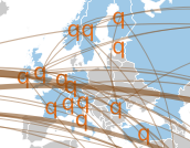
Today, I wanted to make an infographic based on a plot I had done in R. So, I followed Nathan Yau’s advice by exporting the plot to a PDF and loading it into Inkscape. Then came a surprise.
I created the plot with ggplot2 and, among other things,
geom_point(). The PDF looked fine when viewed in OS X’s Preview
application but when I imported the plot into Inkscape all of my
points became the letter “q”.

My first thought was to manually change the q’s back to points in Inkscape. Then I came to my senses and thought that surely I wasn’t the first person to run into this problem. A quick Google search showed that I wasn’t.
It turns out that when exporting to PDF, R may use glyphs from
the Dingbat font set for plot elements. Luckily, this can
be prevented by setting the pdf() routine’s useDingbats option
to FALSE. For example,
pdf("foo.pdf", useDingbats=FALSE)
I re-created the PDF with this option setting, imported it into Inkscape, and basked in the glory of a properly imported graphic.
If you’re curious about the plot itself, I plan to discuss it in a future post. As a teaser, I’ll just say that I had to dust off my trigonometry brain cells and learn a bit more about map projections.
Tags: R