June 8, 2013
Drawing Arcs on Maps
Recently, my employer published their annual sustainability report. On page 107 is a collaboration map that I made based on data from our 2012 annual innovation contest.
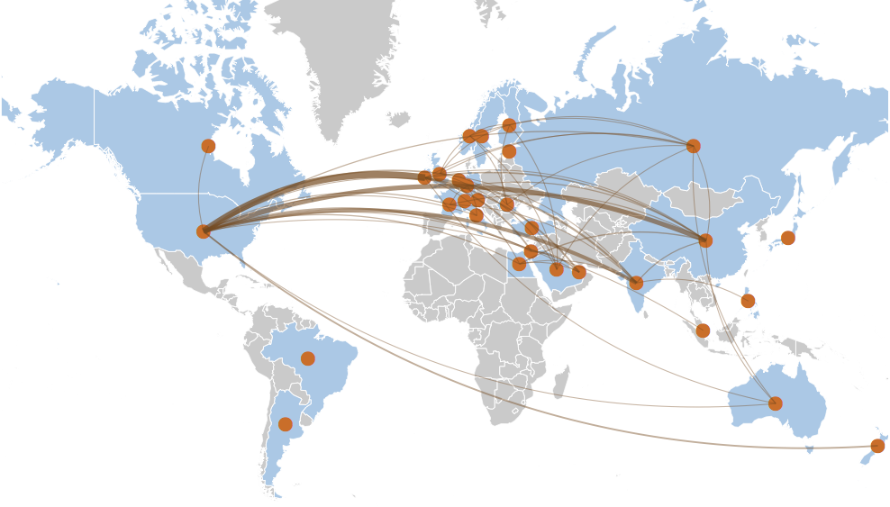
My inspiration was the famous Facebook friendship visualization map. Given the tutorials available on the web, I didn’t expect producing a similar map of our data to take a lot of effort. But then a fun little problem arose.
Consider the following scenario. I want to represent a collaboration between teams in the United States and Russia by drawing an arc between the two countries on a map. Since there are multiple offices in both countries, let’s simplify the problem by using the country centroids as the arc end-points.
The typical approach is to draw the shortest segment of the Great Circle connecting the two locations. This is easy to do using R,
    library(ggplot2)
    library(maptools)
    library(geosphere)

    cntry.info <- data.frame(
                  Country=c("United States", "Russia"),
                  ISO3=c("USA","RUS"),
                  latitude=c(38,60),
                  longitude=c(-97,100),
                  stringsAsFactors=FALSE)

    data(wrld_simpl)
    ws <- fortify(wrld_simpl)

    cntry.idxs  <- which(ws$id %in% cntry.info$ISO3)
    cntry.polys <- ws[cntry.idxs,]

    draw.map <- function(ylim=c(0,85)) {
      ggplot(cntry.polys, aes(x=long, y=lat, group=group)) +
        geom_polygon(fill="#CCCCCC") +
        geom_path(size=0.1,color="white") +
        coord_map("mercator", ylim=ylim, xlim=c(-180,180)) +
        theme(line = element_blank(),
              text = element_blank(),
              line = element_blank(),
              title = element_blank(),
              rect = element_blank())
     }

    arc1 <- gcIntermediate(c(cntry.info$longitude[1],
                             cntry.info$latitude[1]),
                           c(cntry.info$longitude[2],
                             cntry.info$latitude[2]),
                           n=50,
                           addStartEnd=TRUE)

     draw.map() + geom_path(data=as.data.frame(arc1),
                            aes(x=lon, y=lat, group=NULL))
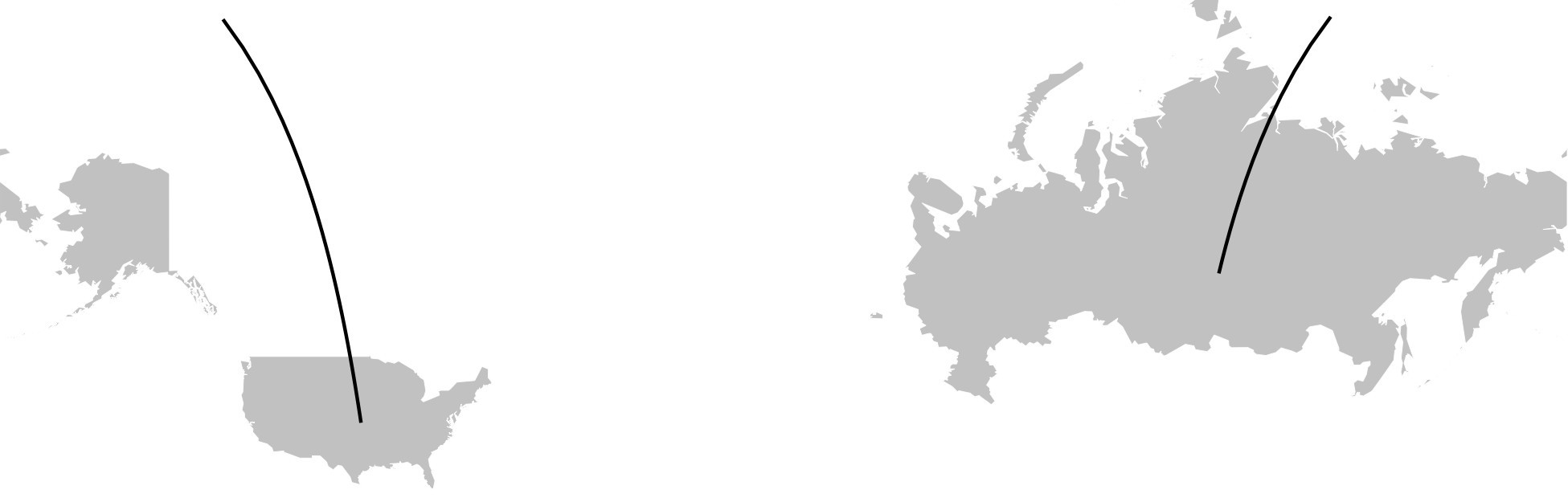
See the problem? The Great Circle arc crosses the antimeridian and gets separated into two disconnected arcs. I realized that the same happened in the Facebook visualization but was much less noticeable due to the large number of arcs, translucency, etc. For my graphic, I thought the separated arcs would be too visually jarring and confusing.
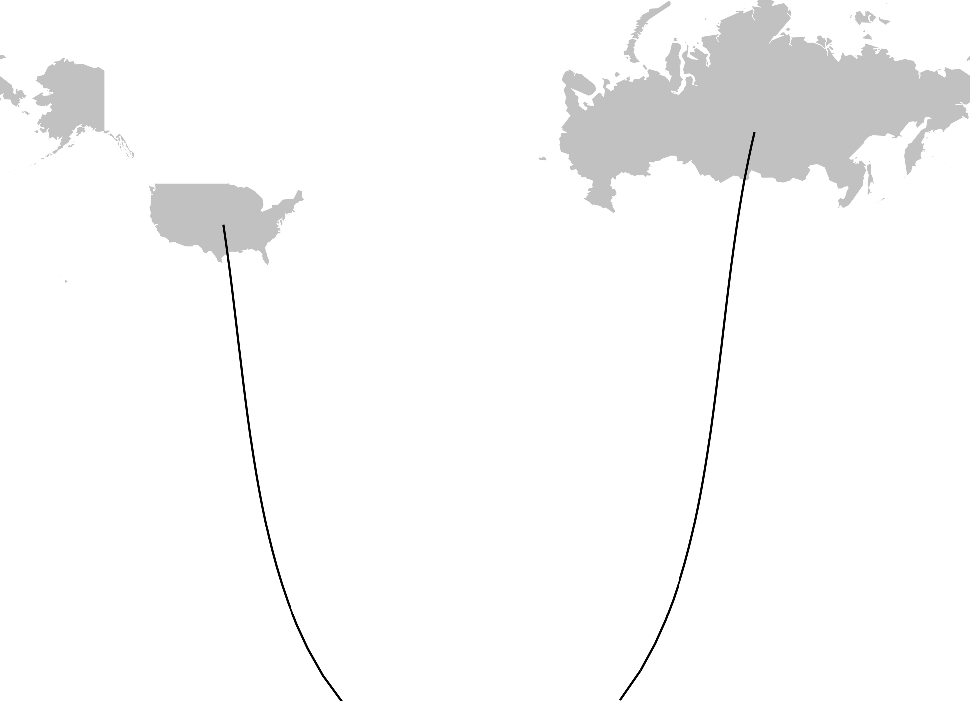
A simple fix was to rotate the map 180 degrees but that would cause the arcs between the United States and Europe to similarly get separated. Using the larger Great Circle segments avoided the split but resulted in odd looking arcs that traveled through the opposite hemisphere.
    mid.point <- midPoint(c(cntry.info$longitude[1],
                             cntry.info$latitude[1]),
                           c(cntry.info$longitude[2],
                             cntry.info$latitude[2]))

    antip <- antipode(mid.point)

    arc2.1 <- gcIntermediate(c(cntry.info$longitude[1],
                             cntry.info$latitude[1]),
                             antip,
                           n=50,
                           addStartEnd=TRUE)

    arc2.2 <- gcIntermediate(c(cntry.info$longitude[2],
                             cntry.info$latitude[2]),
                             antip,
                           n=50,
                           addStartEnd=TRUE)

    draw.map(ylim=c(-90, 85)) +
       geom_path(data=as.data.frame(arc2.1),
                 aes(x=lon, y=lat, group=NULL)) +
       geom_path(data=as.data.frame(arc2.2),
                 aes(x=lon, y=lat, group=NULL))
At this point, it was clear that I had to abandon Great Circles and draw the arcs manually. So I implemented a solution based on Bezier curves.
    p1 <- c(cntry.info$longitude[1],
            cntry.info$latitude[1])
    p2 <- c(cntry.info$longitude[2],
            cntry.info$latitude[2])

    bezier.curve <- function(p1, p2, p3) {
      n <- seq(0,1,length.out=50)
      bx <- (1-n)^2 * p1[[1]] +
            (1-n) * n * 2 * p3[[1]] +
            n^2 * p2[[1]]
      by <- (1-n)^2 * p1[[2]] +
            (1-n) * n * 2 * p3[[2]] +
             n^2 * p2[[2]]

      data.frame(lon=bx, lat=by)
    }

    bezier.arc <- function(p1, p2) {

      intercept.long <- (p1[[1]] + p2[[1]]) / 2
      intercept.lat  <- 85
      p3 <- c(intercept.long, intercept.lat)

      bezier.curve(p1, p2, p3)
    }

    arc3 <- bezier.arc(p1,p2)

    draw.map() +
       geom_path(data=as.data.frame(arc3),
                 aes(x=lon, y=lat, group=NULL))
That looked better but I found it hard to get the splines symmetrical. I also didn’t like hard-coding the mid-point’s latitude.
My next thought was to draw a spline along the unit vector connecting the two points, compute the arc’s height based on the length, and then rotate the points to match the map.
    bezier.uv.arc <- function(p1, p2) {
      # Get unit vector from P1 to P2
      u <- p2 - p1
      u <- u / sqrt(sum(u*u))
      d <- sqrt(sum((p1-p2)^2))

      # Calculate third point for spline
      m <- d / 2
      h <- floor(d * .2)

      # Create new points in rotated space
      pp1 <- c(0,0)
      pp2 <- c(d,0)
      pp3 <- c(m, h)

      mx <- as.matrix(bezier.curve(pp1, pp2, pp3))

      # Now translate back to original coordinate space
      theta <- acos(sum(u * c(1,0))) * sign(u[2])
      ct <- cos(theta)
      st <- sin(theta)
      tr <- matrix(c(ct,  -1 * st, st, ct),ncol=2)
      tt <- matrix(rep(p1,nrow(mx)),ncol=2,byrow=TRUE)
      points <- tt + (mx %*% tr)

      tmp.df <- data.frame(points)
      colnames(tmp.df) <- c("lon","lat")
      tmp.df
    }

    arc4 <- bezier.uv.arc(p1,p2)

    draw.map() +
       geom_path(data=as.data.frame(arc4),
                 aes(x=lon, y=lat, group=NULL))

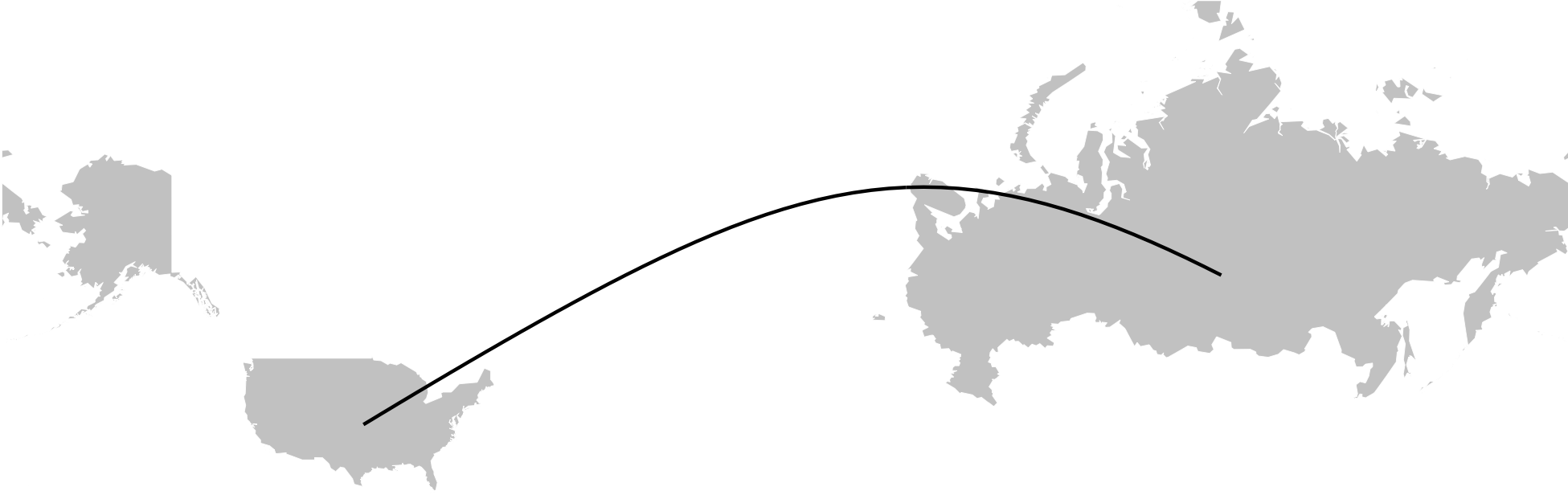
Still not quite right. Eventually, I realized that I wasn’t taking into account the Mercator projection! I added code to transform the latitude coordinates and,
    bezier.uv.merc.arc <- function(p1, p2) {
      # Do a mercator projection of the latitude
      # coordinates
      pp1 <- p1
      pp2 <- p2
      pp1[2] <- asinh(tan(p1[2]/180 * pi))/pi * 180
      pp2[2] <- asinh(tan(p2[2]/180 * pi))/pi * 180

      arc <- bezier.uv.arc(pp1,pp2)
      arc$lat <-  atan(sinh(arc$lat/180 * pi))/pi * 180
      arc
    }

    arc5 <- bezier.uv.merc.arc(p1, p2)
    draw.map() +
       geom_path(data=as.data.frame(arc5),
                 aes(x=lon, y=lat, group=NULL))
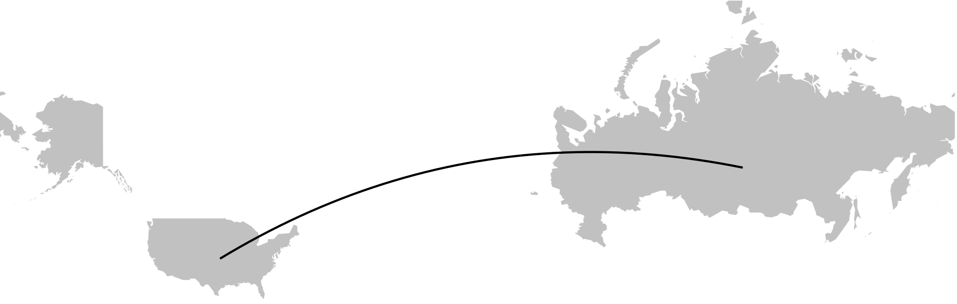
Viola!
The real code had more error checking and additional support for southern and inter-hemisphere arcs. But that’s not too hard to add so I left those details out of the above examples for clarity.
Overall, I was happy with the way the map came out. I wasn’t expecting the extra work to draw the arcs but, I must admit, I had fun working through the trigonometry and map projections. That’s what I like about data science projects, you never know the interesting challenges that will arise.
Tags: R