September 19, 2014
Customizing ggplot2 charts
I love Hadley Wickham’s ggplot2 package for creating charts in R. It’s one of the things that really hooked me into using R for data analysis. Despite being based on fairly simple design principals, ggplot2 can have a steep learning curve, especially in customizing the appearance of charts. This post provides a short example of how I work with ggplot2 to create and customize plots.
First, let’s create some data to play with,
    set.seed(1337)
    samp.names <- sapply(seq(1:10), function(x) paste("Category",x,sep="."))
    samp.data <- data.frame(samp  = factor(samp.names,
                                           levels=samp.names,
                                           ordered=TRUE),
                            value = runif(10, -10, 10))
Next, let’s load the ggplot2 package, create the base
ggplot chart object, associated it with the samp.data
dataset and define the x and y aesthetics.
    library(ggplot2)
    p <- ggplot(samp.data, aes(x=samp, y=value))
In ggplot, plots are created by adding layers to the base ggplot
object using an overloaded version of the “+” operator. To create a
bar plot, we add the result from calling geom_bar(). By default,
geom_bar() will try to create a stacked histogram so we need
to provide a couple of arguments to tell geom_bar() to use the data
as is.
p <- p + geom_bar(stat="identity", position = "identity")
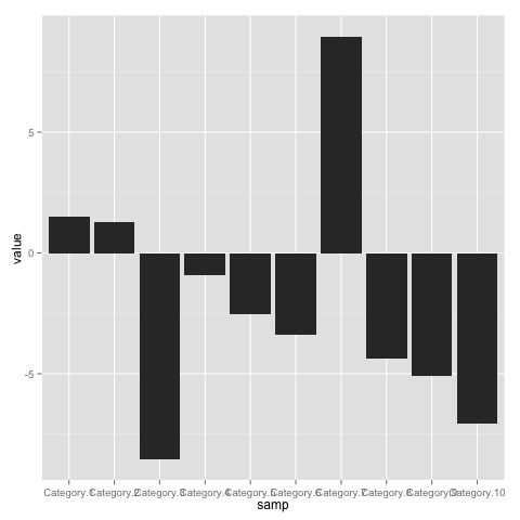
Evaluating p at the R prompt generates the chart. The result is a
bit Meh.
To start, lets add a title and remove the axis labels by
adding a labs() layer to the ggplot object.
    p <- p + labs(x="",
                  y="",
                  title="Measured Count per Category")
Similarly, let’s fix the y axis breaks using a scale layer.
p <- p + scale_y_continuous(breaks=seq(-10,10,by=2))
The overlapping x axis labels really need to be fixed.
Let’s make them a bit smaller and rotate them 45 degrees
using a theme layer,
    p <- p + theme(axis.text.x =
                   element_text(size  = 10,
                                angle = 45,
                                hjust = 1,
                                vjust = 1))
Getting better,

But those large, gray bars are depressing me. Let’s give them
some color by providing the fill argument to geom_bar().
Now, I could re-build the chart from scratch but, instead,
I’m going to take a short cut.
Let’s take a closer look at this mysterious variable p
that we keep assigning to,
    > library(pryr)
    > otype(p)
    [1] "S3"
    > names(p)
    [1] "data"        "layers"      "scales"      "mapping"     "theme"
    [6] "coordinates" "facet"       "plot_env"    "labels"
    > p$layers
    [[1]]
    geom_bar:
    stat_identity:
    position_identity: (width = NULL, height = NULL)
This tells us that p is an S3 object with a member layers that appears
to be a list of the plot’s layers. Turns out, we can update the geom_bar()
layer by simply replacing it with the result of a new call.
    p$layers[[1]] <- geom_bar(stat="identity", position = "identity",
                              fill=rgb(56,146,208, maxColorValue = 255))
Now, be warned, this is a bit of a hack that may break in the future. However, hacks like this can speed up prototyping and are generally OK as long as we build the final graphic using the proper methods.
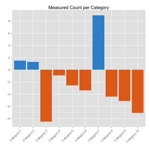
Here’s the new version with colored bars.

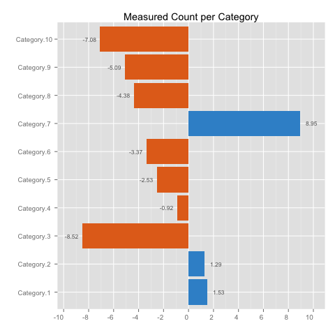
Changing color is a nice touch but it would be better if the color communicated information. Let’s change the plot to draw positive and negative bars in different colors,
    p$layers[[1]] <- geom_bar(stat="identity", position = "identity",
                              fill=ifelse(samp.data$value > 0,
                                rgb(56,146,208, maxColorValue = 255),
                                rgb(227,111,30, maxColorValue=255)))
Let’s add data labels to satisfy any need for knowing exact values,
p <- p + geom_text(aes(x=samp, y=value, label=value))
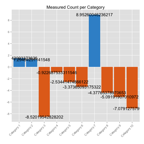
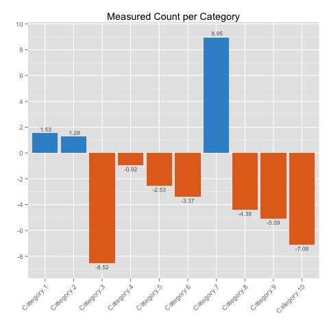
Yikes, the default labels look terrible. Let’s customize the label text by making it smaller, reducing the precision, and softening the color. We’ll again use the same layer replacement shortcut.
    p$layers[[2]] <-
         geom_text(aes(x=samp,
                       y=value + 0.3 * sign(value),
                       label=format(samp.data$value, digits=2)),
                   hjust=0.5,
                   size=3,
                   color=rgb(100,100,100, maxColorValue=255))
This version looks good but the angled x axis labels still feel
awkward. Let’s rotate the plot by adding a call to coord_flip() and
make minor adjustments to make things look good in the new
orientation. Ignore a warning message about replacing the y axis
scale, ggplot does the right thing,
    p$theme[[1]]$angle <- 0
    p$layers[[2]] <- geom_text(aes(x=samp,
                                   y=value + 0.3 * sign(value),
                                   label=format(samp.data$value, digits=2),
                                   hjust=ifelse(value > 0,0,1)),
                               size=3,
                               color=rgb(100,100,100, maxColorValue=255))
    p <- p + theme(axis.text.y =
                   element_text(hjust = 0.5))
    p <- p + scale_y_continuous(breaks= seq(-10,10,by=2),
                                limits= c(min(samp.data$value) -1,
                                  max(samp.data$value) + 1))
    p <- p + coord_flip()
As a final tweak, let’s get rid of adornments,
    p <- p + theme(panel.background = element_blank(),
                  panel.grid.minor = element_blank(),
                  axis.ticks  = element_blank(),
                  axis.line   = element_line(colour=NA),
                  axis.line.x = element_line(colour="grey80"))
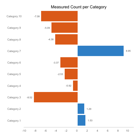
Compared to where we started, this looks pretty good. I’m not sure if Tufte or Few would agree with all of my choices, but I think the outcome is more functional and visually pleasing.
When put all it all together, the final code looks a bit intimidating but hopefully this post showed that using an incremental process can make the task much easier.
    p.final <-
     ggplot(samp.data, aes(x=samp, y=value)) +
           geom_bar(stat="identity", position = "identity",
                    fill=ifelse(samp.data$value > 0,
                      rgb(56,146,208, maxColorValue = 255),
                      rgb(227,111,30, maxColorValue=255))) +
           geom_text(aes(x=samp,
                         y=value + 0.3 * sign(value),
                         label=format(samp.data$value, digits=2),
                         hjust=ifelse(value > 0,0,1)),
                     size=3,
                     color=rgb(100,100,100, maxColorValue=255))  +
           scale_y_continuous(breaks= seq(-10,10,by=2),
                              limits= c(min(samp.data$value) -1,
                                max(samp.data$value) + 1)) +
           labs(x="",
                y="",
                title="Measured Count per Category") +
           theme(axis.text.x =
                 element_text(size  = 10,
                              angle = 0,
                              hjust = 1,
                              vjust = 1),
                 axis.text.y =
                 element_text(hjust = 0.5),
                 panel.background = element_blank(),
                 panel.grid.minor = element_blank(),
                 axis.ticks  = element_blank(),
                 axis.line   = element_line(colour=NA),
                 axis.line.x = element_line(colour="grey80")) +
           coord_flip()
This simple example only scratched the surface of ggplot’s capabilities. If you’d like to learn more, then I highly recommend looking over the documentation, watching this talk on YouTube, or buying Hadley’s book.
Other great R packages written by Hadley include dplyr, reshape2, stringr, and lubridate. Check them out!
Tags: Visualization , R , ggplot2